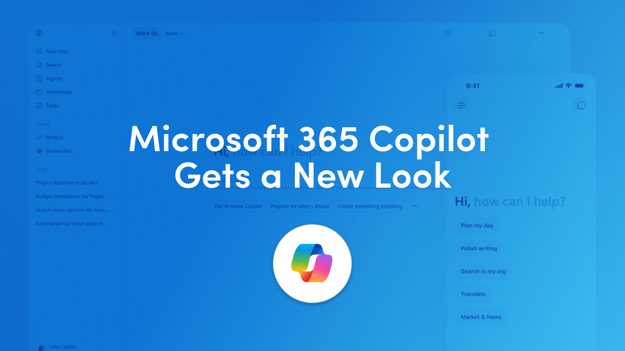
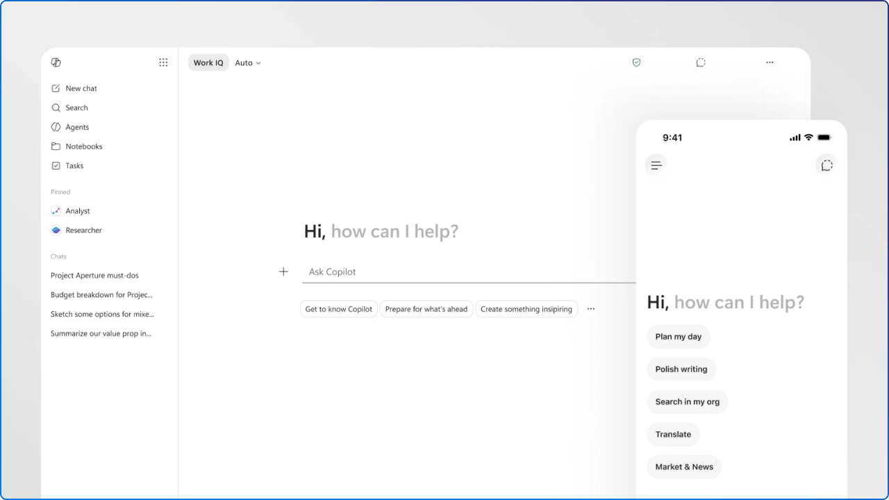
Microsoft has introduced a new design for Microsoft 365 Copilot, describing it as a cleaner, faster, and more connected experience across the Copilot app and Microsoft 365 apps. On the surface, this looks like another interface refresh. A new layout. New interaction patterns. A more neutral visual treatment. A reshaped prompt area. A different way for Copilot to show up across Word, Excel, PowerPoint, Outlook, and the broader Microsoft 365 experience.
That shift matters because Copilot is no longer a chat box sitting beside your work. Microsoft describes the new experience as a move from a static prompt line to a task-aware workspace, where the prompt area gives people more room to express what they need, while related tools and controls appear beneath it based on the task at hand. In plain language, Microsoft is trying to make Copilot feel less like a separate destination and more like part of the work itself.
Not every change in this redesign will land the same way for every user. The clearest example is the new WorkIQ pill, which quietly replaces the old Work and Web toggle. It may look cleaner, but it asks the user to trust a label they've never seen before. For organizations still working to grow Copilot confidence, that's a small design decision with a potentially large adoption cost.
One of the biggest updates is the prompt experience itself. The new design gives the prompt line more room and turns it into a task-aware workspace, with tools and controls appearing below it to support the work at hand. That matters because prompting is not always a quick one-line action. People paste content. They ask layered questions. They refine ideas. They compare options. They want to keep formatting intact. They often arrive with messy, half-formed thoughts and expect the system to help shape them into something useful.
Microsoft also says the prompt surface can expand to fill the experience, giving people more room for deeper work, such as pasting content, retaining structure, and using inline formatting before sending. That is a meaningful improvement, because it treats prompting as a real work activity rather than a search query. In previous AI experiences, the input box often felt small, temporary, and was hard to work with on longer prompts. This new direction suggests the prompt itself is becoming part of the workspace.
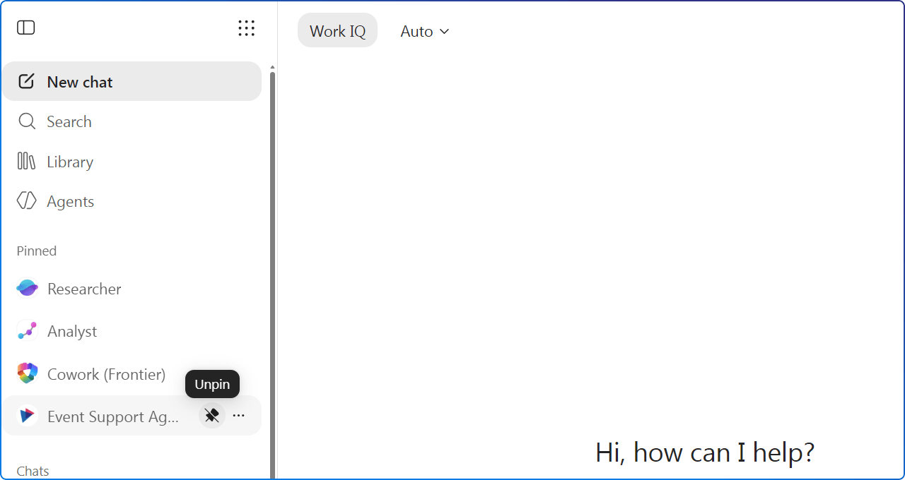
The left navigation has also been redesigned. That may sound like a small layout change, but navigation is one of the quiet foundations of trust. If people cannot find their previous conversations, return to work in progress, or understand where their agents and tools live, they will not build habits around the experience. A more flexible navigation model can reduce visual clutter while still keeping important tools within reach.
Another highlight is the shared pinning system and more room for session recall, both intended to help people return to work in progress. This is especially important for modern digital workplace scenarios, where work rarely happens in a single sitting. People start something before a meeting, return to it after lunch, pick it up again the next day, and then share it with a colleague. If Copilot is meant to support real work, it needs to support that stop-and-start rhythm.
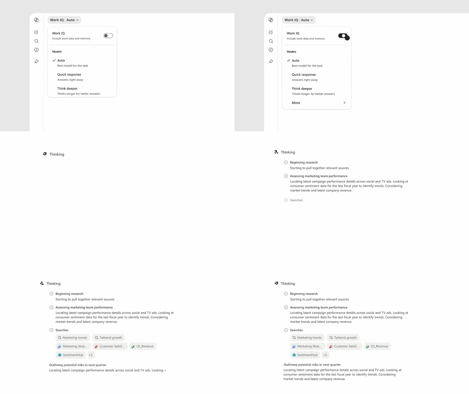
One of the most visible changes is also one of the most quietly disruptive. The familiar Work and Web toggle, the control that told Copilot whether to ground its answers in your organization's data or the open web, is no longer front and center. In its place sits a small pill labelled WorkIQ.
Visually, it's a cleaner look. Strategically, it hints at where Microsoft is heading: a smarter, more context-aware Copilot that decides for you. But here's the question worth asking: do most users actually know what WorkIQ means?
For people who have spent months learning to toggle between Work and Web, this change removes a control they understood and replaces it with a label they don't. That's a small friction point on its own, but multiplied across an organization it can quietly chip away at confidence, and confidence is the engine of adoption.
This update places a greater focus on progressive disclosure. The Copilot interface starts with a clean, focused interface and revealing more capabilities as people need them. Think, less clutter and elements visible on the page, and more focus. This is one of the most important ideas behind the redesign. Progressive disclosure is a classic UX design principle, and it is especially useful in AI experiences because these tools can quickly feel overwhelming. There are prompts, agents, files, meetings, chats, actions, models, summaries, and generated outputs. If all of that appears at once, the interface may look powerful, but it can also feel noisy.
A cleaner interface helps people focus. It does not remove complexity. It manages complexity. That distinction matters. In a workplace context, people are not opening Copilot to admire the interface. They are trying to write a better update, summarise a meeting, understand a document, prepare a presentation, or make progress on a task. The best interface is often the one that helps people move forward without making them think too much about the interface itself.
This is where the neutral visual design becomes interesting. The black and white treatment may feel stark to some users, especially compared with more colourful Microsoft 365 experiences. There is a strong UX argument for visual restraint in an AI workspace though. When the system is generating, summarising, structuring, and rewriting content, the content should remain the focus. A quieter interface reduces competition between decoration and output. It can also make the experience feel more like a work surface than a promotional layer.
"As UX professionals move from creating interfaces to orchestrating coherence across complex and nondeterministic systems, we play a heightened role in turning clutter into clarity, fragmentation into flow, and intention into impact."
Jon Friedman, Chief Design Officer, Microsoft 365
That statement is worth sitting with. In traditional software, we often evaluate UX by looking at menus, buttons, labels, navigation, and page layout. Those things still matter. With Copilot, the generated response is also part of the experience. If the response is poorly structured, hard to scan, or out of step with the user's intent, the experience fails even if the interface looks beautiful.
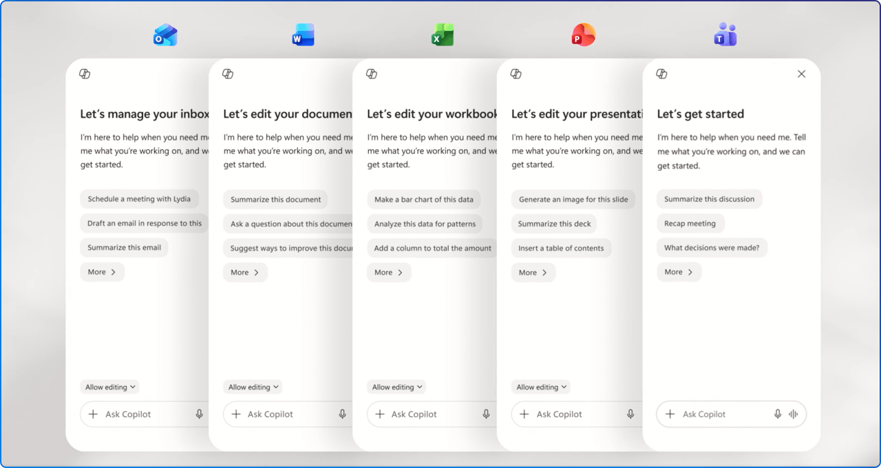
Another important change is how Copilot appears across Microsoft 365 apps. Microsoft says it has created a single, flexible entry point for Copilot across these apps, one that can suggest relevant actions to help people in their work. This matters because consistency has been one of the open challenges with Copilot. If Copilot feels different in every app, people have to keep relearning where it lives, what it can do, and how to start.
The new in-app experience provides a consistent entry point that sits above the user's work and understands the context beneath it. That is a subtle but important shift. Rather than asking people to leave their document, spreadsheet, slide, or inbox to ask for help, Copilot is being positioned closer to the object of work.
That is a meaningful change for the digital workplace. For years, productivity software has asked people to move between modes: think in one place, write in another, design somewhere else, analyse in a spreadsheet, then summarise in an email. Microsoft's design argument is that thinking and making are often connected, and Copilot should support that loop rather than interrupt it.
One of the more practical parts of the announcement is performance. Based on recent test scenarios by Microsoft, the Copilot app now loads more than twice as fast, with load times reduced by over 50%, based on customer testing conducted from 10 to 17 March 2026. Microsoft also says response times for complex chat prompts improved by about 10% at the 95th percentile, based on testing that measured how long it takes Copilot to start responding after a prompt is submitted.
These numbers matter because speed is not just a technical metric. It shapes trust. If an AI tool feels slow, people hesitate to use it. If it responds quickly but produces messy output, people still lose time cleaning it up.
That point is important for anyone leading Copilot adoption. People rarely separate interface performance from content quality. They simply ask, "did this help me get my work done?" If Copilot loads faster, responds faster, and produces outputs that are easier to scan, the experience has a better chance of becoming part of everyday work.
Even when a redesign is thoughtful, change still creates friction. This is especially true in Microsoft 365, where the tools sit at the centre of people's daily routines.
A redesigned Copilot experience may be cleaner, faster, and more connected, but people still have to adjust their mental model. Where do I go now? What moved? What does this new button do? Why does Copilot appear differently here than it did last week?
That adjustment period is real, and it is easy to underestimate. For some, change can feel exciting because we see the direction of travel. For everyday users, change often arrives as interruption. They may not care that the interface is based on progressive disclosure. They care about finishing a report before a meeting.
This is why communication and adoption support matter. The story should not be "Microsoft changed the interface, get used to it." The better story is "Microsoft is trying to reduce clutter, bring Copilot closer to your work, and make the experience faster and more focused." That framing gives people a reason to explore the change rather than simply react to it.
Tip: If your people are asking why Copilot looks different, keep the message simple.
Encourage colleagues to spend a little time exploring the new layout, even if it's just 10 minutes. Save one or two prompts they use often, and try Copilot directly inside a document or slide rather than only in chat. Most of the change is about reducing friction, not relearning the tool.
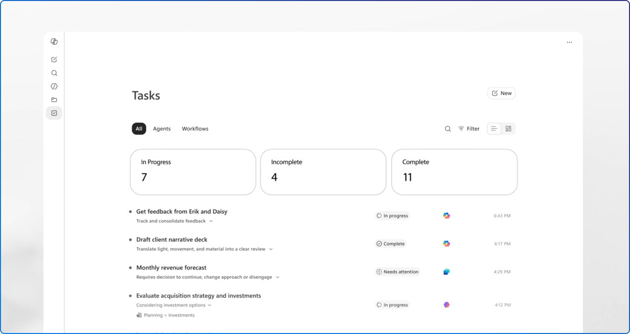
The redesign also sits within the larger role of the Microsoft 365 Copilot app. This context helps explain why the interface needs to evolve. The Microsoft 365 Copilot app is not just a launcher, and it is not just a chatbot. It is becoming a central place for AI-assisted work across content, conversations, files, apps, and agents.
This is also why navigation, pinning, history, prompt space, and contextual tools matter so much. The more Copilot becomes a place where people start, continue, and return to work, the more the design needs to support continuity. A clean first impression is useful. A clear return path is even more useful.
The new Microsoft 365 Copilot design is not really about making the product look modern. It reflects a bigger design challenge: how do you make AI feel useful, understandable, and present, without making it feel intrusive?
Good design is not only about what ships. It is about how people adapt, how consistently patterns are applied, and whether the experience continues to feel helpful after the novelty wears off.
The real test is not whether the new Copilot looks cleaner on launch day. The real test is whether it helps people think more clearly, move more confidently, and produce better work with less friction.
At 2toLead, we spend a lot of time helping organisations make the most of Microsoft 365, Copilot, and the digital workplace, with a particular focus on adoption, employee experience, and inclusive design. If this redesign has you rethinking how Copilot shows up for your people, we have practical resources that can help.

Explore our Copilot adoption guidance and the Definitive Guide to Improving Microsoft 365 Adoption for strategies on rolling out AI experiences in a way that actually sticks.


Join Our Newsletter