
By clicking “Accept”, you agree to the storing of cookies on your device to enhance site navigation, analyze site usage, and assist in our marketing efforts. View our Cookie Policy for more information.
Icon Rounded Closed - BRIX Templates
Insights

Beyond 'Active Users': The Copilot Adoption Metrics That Actually Prove Value

5 mins
share on
Beyond 'Active Users': The Copilot Adoption Metrics That Actually Prove Value
Microsoft Copilot Dashboard
What is the biggest mistake leaders make when measuring Microsoft 365 Copilot adoption?

Relying on "active users." It's a vanity metric. It tells you someone opened Copilot, not whether they got value, changed how they work, or returned a single dollar of ROI. If your CFO asks, "Is Copilot working?" and your only answer is "87% of licensed users are active," you're measuring the wrong thing.

The organizations winning with Copilot in 2026 aren't the ones with the highest activation rate. They're the ones who can trace Copilot usage to time saved, quality gained, and business value created. This guide breaks down the Copilot adoption metrics that actually prove value, organized into four measurement dimensions and the KPIs that matter inside each.

Why "Active Users" Is a Vanity Metric

Active user rate measures access, not impact. A user who opens Copilot once a month and a user who saves five hours a week can both count as "active," which makes the number nearly useless for decision-making.
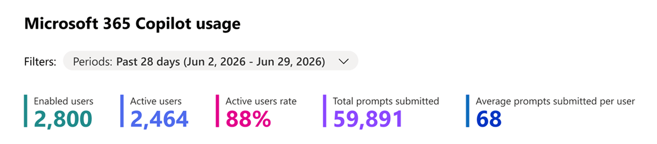
Microsoft 365 admin center Copilot usage report showing enabled users, active users, and active user rate

The problem compounds when leaders build a business case on it:

  • It hides uneven adoption. High activation can mask the reality that value is concentrated in a small power-user group while everyone else churns.
  • It ignores depth. Opening Copilot isn't the same as using it on repeatable, high-value work.
  • It can't defend a renewal. "People are logging in" is not an ROI argument a finance leader will fund.

The fix is a layered measurement framework. Instead of one number, you track adoption across four connected dimensions, each answering a different question your stakeholders actually care about.

The 4 Dimensions of Copilot Adoption Measurement

What are the four dimensions of Copilot adoption metrics? Activation, engagement, productivity, and business impact. Together they build a chain of evidence, from "are people using it?" all the way to "is it worth the investment?"

  • Activation: Are people using it?
  • Engagement: How deeply are they using it?
  • Productivity: Is it saving time and improving quality?
  • Business impact: Is it delivering measurable ROI?

Each dimension needs different data sources and a different response when the numbers fall short. Let's unpack the KPIs inside each.

Dimension 1: Activation Metrics (Are People Using It?)

Activation is your entry point, just don't stop here. Track it, but pair it with depth.

  • Active User Rate (defined correctly): Set a meaningful threshold (e.g., used Copilot on 3+ days in the last 28), not "opened once."
  • Feature Adoption Distribution: Which surfaces are people using: Teams, Outlook, Word, Excel? Concentration in one app signals an enablement gap elsewhere.
  • Daily vs. Monthly Active Users (DAU/MAU): The ratio reveals whether Copilot is a daily habit or an occasional novelty.

Dimension 2: Engagement Metrics (How Deeply Are They Using It?)

Engagement separates experimentation from real workflow integration.
  • Prompts per session: Rising depth signals users are iterating, not just running one-off queries.
  • Feature discovery rate: Are users expanding beyond a single use case over time?
  • Repeat-task usage: The strongest early signal of value, as people return to Copilot for the same recurring work.

Dimension 3: Productivity Metrics (Is It Saving Time?)

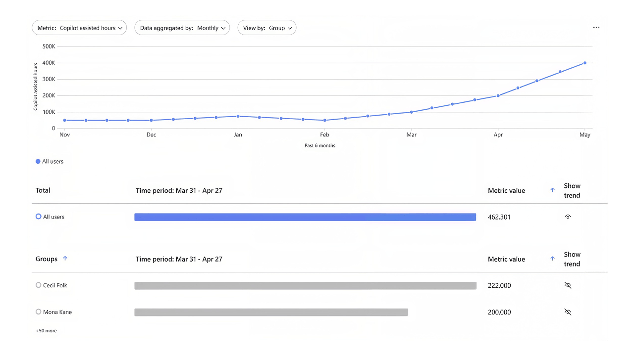
Microsoft Copilot Dashboard impact view showing Copilot assisted hours and estimated time savings

This is where adoption starts translating into value, but avoid the "theoretical time saved" trap. Anchor claims to real, measured tasks.

  • Time saved per user, per week: Best captured through a mix of self-reported surveys and observed task data.
  • Task completion / cycle-time reduction: For example, post-meeting recap time dropping from 30 minutes to 5.
  • Quality and consistency gains: Fewer errors, more consistent outputs, less rework.

Dimension 4: Business Impact Metrics (Is It Delivering ROI?)

This is the dimension your executives remember. It connects usage to money and outcomes.

  • Copilot ROI: Time saved times fully loaded hourly value, measured against licence cost and payback period.
  • Cost avoidance: Hiring deferrals, reduced outsourcing, or lower translation/processing costs.
  • Revenue and strategic impact: Faster decisions, improved customer-facing output, and employee confidence that compounds over time.

Want to see this modeled end-to-end? Our Microsoft 365 Copilot Case Study: Adoption That Delivered Measurable ROI unpacks the full math behind 1,115.6 hours saved, ~$83.7K in productivity value, and a 4.5-month payback for a 2,000-employee global nonprofit.

Where to Track Copilot Metrics: Dashboards & Data Sources

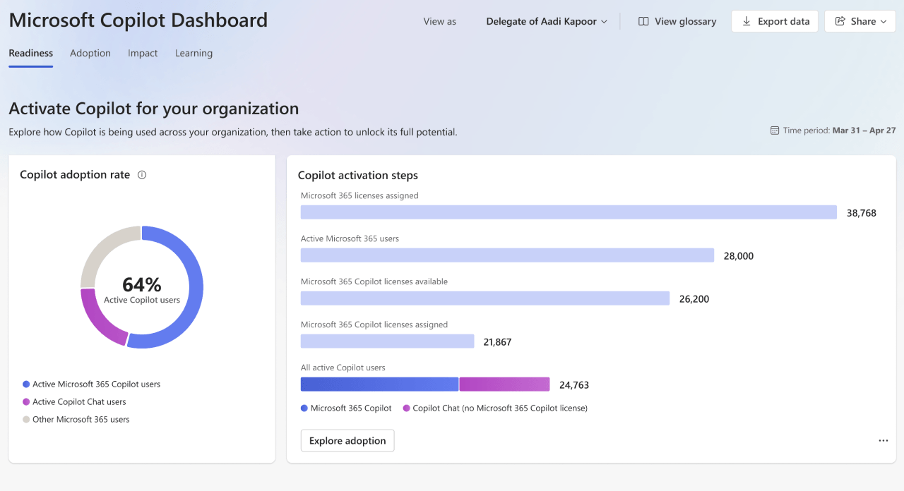
Where do you actually find Copilot adoption data? Start with the Microsoft Copilot Dashboard in Viva Insights, the Readiness & Adoption report in the Microsoft 365 admin center, and Power BI for advanced reporting.

Each source serves a different layer of the framework:

  • Readiness & Adoption report (admin center): Best for licensing decisions and early rollout targeting.
  • Copilot Dashboard (Viva Insights): Surfaces readiness, adoption, impact, and sentiment metrics, including Copilot Assisted Hours and estimated financial savings.
  • Advanced Power BI reporting: For custom analysis, benchmarking, and connecting Copilot signals to business KPIs.

Each surfaces different metrics, and we break down the newest capabilities in New Copilot Dashboard Boosts AI Visibility and Reporting.

A note on interpretation: Copilot is rarely the sole driver of any single metric. Seasonality, role changes, and org shifts all influence the numbers, so pair quantitative dashboards with qualitative signals like user confidence and sentiment for a defensible story.

Turning Metrics Into a Value Story Leaders Fund

How do you turn Copilot metrics into an ROI story executives will act on? Move the conversation from "time saved" to "value created." Raw activity data rarely wins budget; a narrative that ties adoption to business outcomes does.

Three principles keep your measurement credible:

  • Set baselines before you measure. You can't prove improvement without a "before" number.
  • Make every KPI trace to a business outcome. If a metric doesn't connect to efficiency, quality, revenue, or strategic value, it's noise.
  • Report on a cadence. Adoption is a long-term evolution, not a one-time project, so review monthly or quarterly with a named sponsor.

For a practical framework, including baselines, A/B experiments, and executive dashboards, our session resource Measuring Copilot & Agent ROI: From Time Saved to Value Created is built exactly for this. And because measurement only works when people actually adopt, it pairs well with Building an AI-Ready Culture for Copilot and our take on Key IT Strategies for Copilot Adoption.

From Vanity Metrics to Proven Value

The shift is simple to say and hard to do: stop counting logins, start proving value. When you measure Copilot across activation, engagement, productivity, and business impact, and anchor every KPI to a real outcome, you move from "people are using Copilot" to "here's exactly what it's worth." That's the difference between a stalled pilot and a funded, scaled, governed rollout.

Get the Copilot ROI Measurement Playbook
Case Study Details

Similar posts

Get our perspectives on the latest developments in technology and business.
Love the way you work. Together.
Next steps
Have a question, or just say hi. 🖐 Let's talk about your next big project.
Contact us
Mailing list
Occasionally we like to send clients and friends curated articles that have helped us improve.
Close Modal