

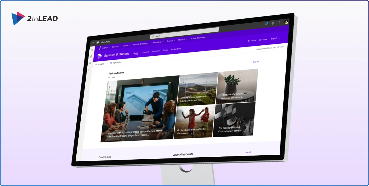
Designing a modern SharePoint site that looks great and aligns with your brand can be tricky, especially when you’re working directly in the live environment. Every change feels like a risk, and iterating on design ideas often means creating test pages or publishing updates that aren’t quite ready.
That’s why the SharePoint Content Creator Toolkit on Figma is such a game-changer. This resource empowers designers, content creators, and intranet managers to prototype SharePoint pages visually before touching the actual site. With its latest update, the toolkit makes it easier than ever to plan, design, and share your ideas with stakeholders.
The toolkit is designed to replicate the SharePoint experience inside Figma, giving you a safe, flexible space to experiment. Here’s what you can do with it:
This means you can validate your design decisions early, share them with your team for feedback, and avoid the frustration of rework later in the process.
👉 Explore the toolkit on Figma
The recent update to the SharePoint Content Creator Toolkit introduces several enhancements that make the design process even smoother:
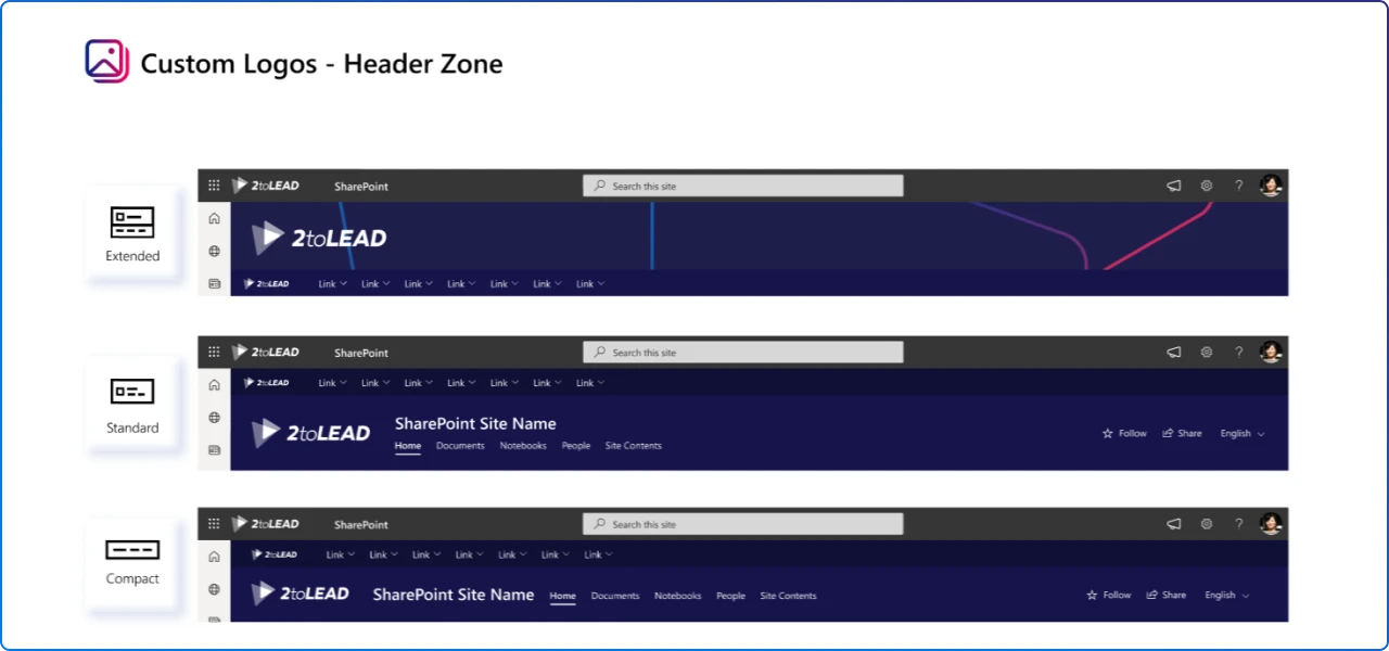
Quickly visualize how your company branding will appear without hunting for assets.
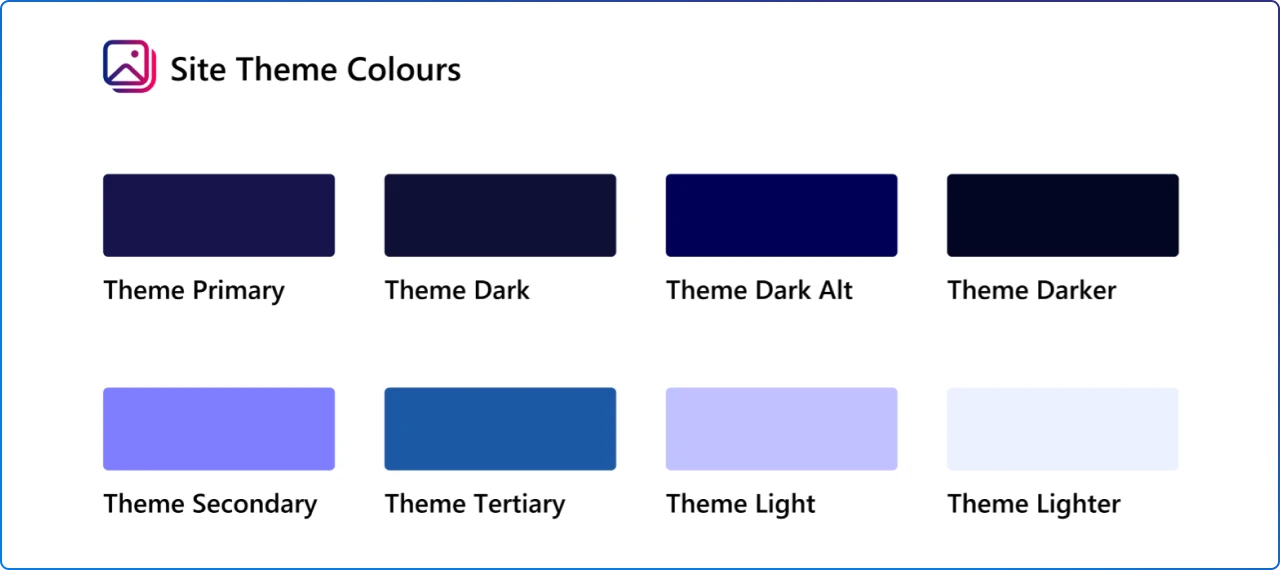
Theme colors are now added as reusable styles in the Site and Hub Logos page, making it easier to maintain brand consistency across your mockups.
Small but impactful tweaks to components improve alignment and usability, ensuring your designs look closer to the real SharePoint experience.
These updates are all about speed and accuracy, helping you move from concept to approval faster than ever.
If you’ve ever tried to design a SharePoint site without a visual planning tool, you know the pain:
The SharePoint Content Creator Toolkit solves these problems by moving the design process into Figma, a platform built for collaboration and iteration. You can work faster, present polished concepts, and ensure brand consistency before a single page goes live.
Once your design is finalized in Figma, replicate it in SharePoint using modern page layouts, flexible sections, and out-of-the-box web parts. This approach ensures your intranet remains easy to maintain and future-proof, without relying on heavy customizations.
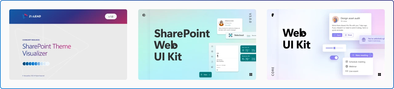
Looking to expand your design toolkit? Here are some additional Figma resources that complement the SharePoint Content Creator Toolkit:
The updated SharePoint Content Creator Toolkit isn’t just a design resource, it’s a productivity booster for anyone building modern intranets.
By leveraging Figma, you can design with confidence, collaborate effectively, and deliver a polished SharePoint experience without unnecessary complexity.
👉 Download the toolkit on Figma and start designing smarter today!


Join Our Newsletter