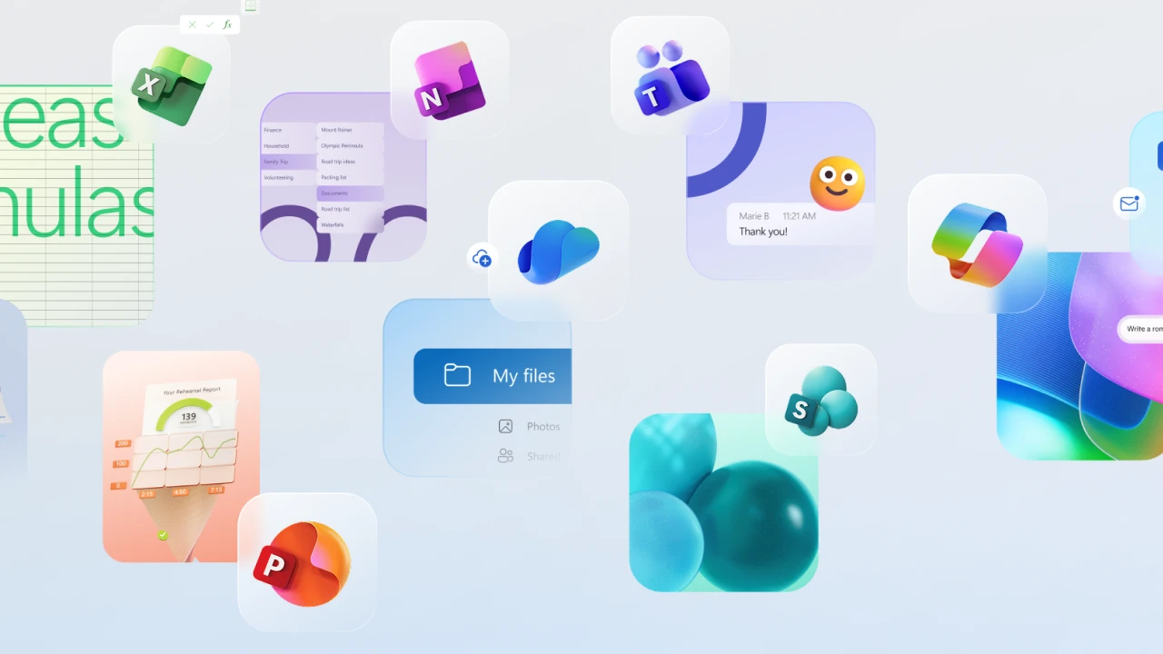
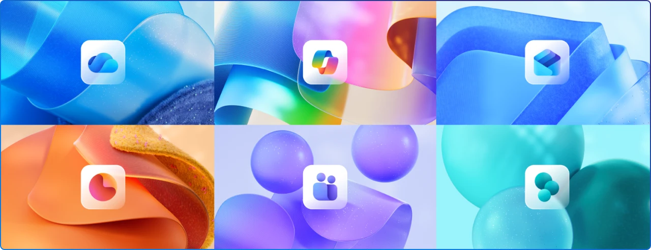
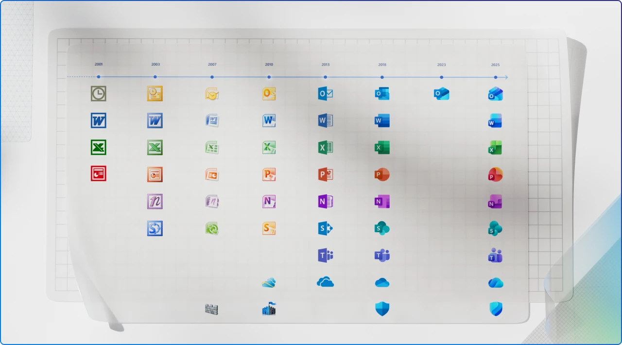
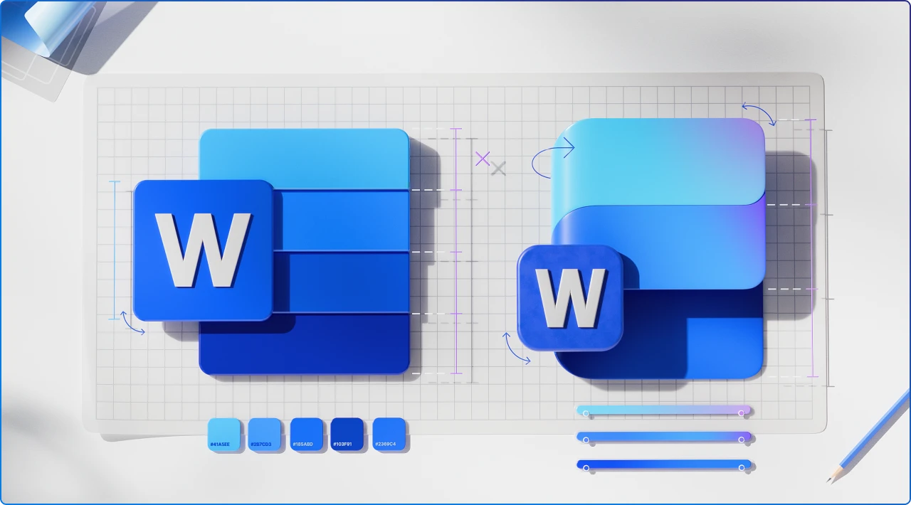
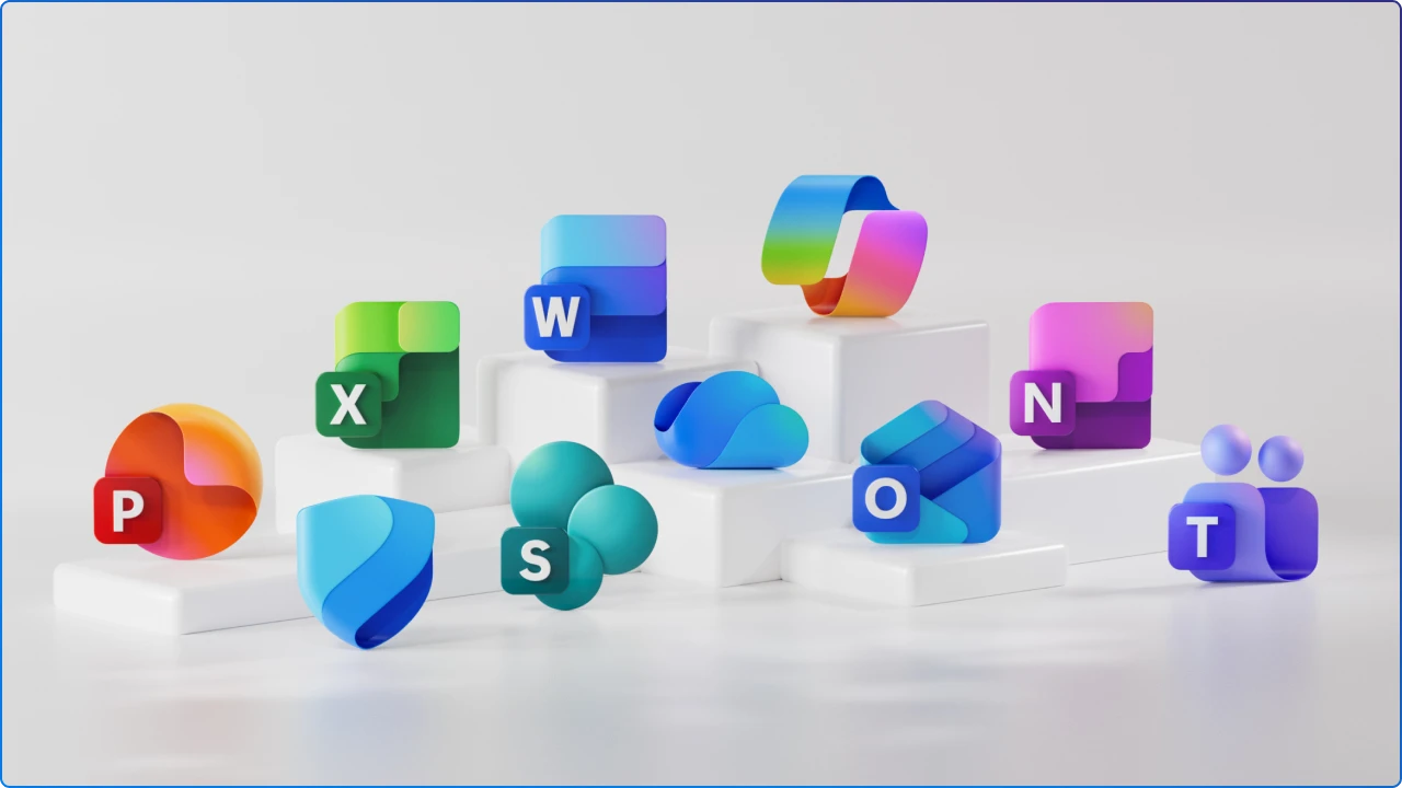
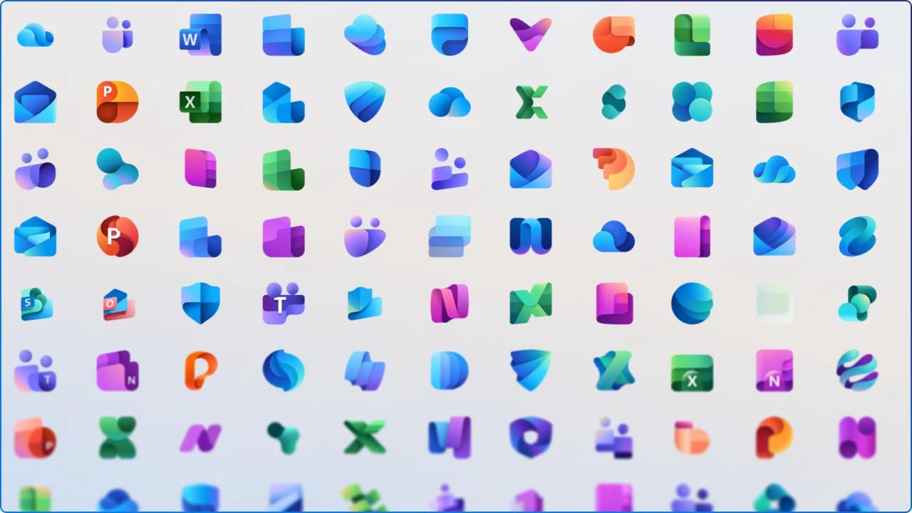
On October 1, Microsoft began rolling out refreshed Microsoft 365 app icons with softer, fluid shapes and brighter gradients. It’s the first broad update since 2018 and it lands alongside Copilot’s deeper presence across the suite.
Microsoft positions the change as more than aesthetic, icons as a signal of outcome‑led, human‑and‑AI collaboration
This isn’t a recap. Microsoft and the tech press have covered the “what.” We’ll explore the “so what” for Employee Experience (EX): how visual language shapes wayfinding, trust, and adoption in your digital workplace, and what you can tactically do next.
It’s a look at what these icons mean for Employee Experience in the digital workplace and where the design language is likely headed next.
Even minor changes to familiar marks do real work in the brain. People rely on pre-attentive cues like shape, color, and contrast to recognize targets quickly in dense interfaces. When icons are clearer and more cohesive, wayfinding becomes faster and less effortful. That matters when your “launcher” is a taskbar, a Teams app rail, or a mobile grid.
Microsoft’s rationale tees up those exact benefits: more legible forms, stronger tonal transitions, and a single visual rhythm across apps and surfaces. The throughline is cognitive ease. When the surface calms down, people can spend more time on intent and less on hunting.
The language aligns with Copilot’s premise. Start with intent, then traverse apps as needed. The icons visually normalize that journey.
Design press noted a wider trend where colorful gradients have become a common motif for AI‑era branding. Expect to see this pattern persist in Microsoft 365 and beyond.
Keeping letter plates balances recognition with modernity. That’s less about nostalgia and more about not taxing working memory for the sake of novelty.
The icon language harmonizes with a workflow where you start with intent, then traverse apps as needed. This mirrors Copilot’s proposition: “state your outcome, let the system route you.” Expect more surfaces that make app boundaries feel thinner.
Gradients have become a visual shorthand for “AI” in brand systems this year. Microsoft’s palette shift sits inside a broader design trend where color depth and subtle dimensionality communicate intelligence and motion without adding literal 3D.
Richer contrast and simplified internal shapes are accessibility wins and practical on high‑DPI, HDR screens. They’re also culture signals: inclusive by default. Expect more explicit accessibility commitments in future design updates and admin guidance.
Visual continuity lowers adoption friction. If apps look like a family, people trust the hand‑offs, especially when a conversational agent sits in the middle. This is design doing change management quietly, one square at a time.
Design changes like these remind us that the digital workplace isn’t static. It evolves in ways both visible and invisible. A refreshed icon might seem small, but it signals a shift toward experiences that feel more human, more fluid, and more intelligent.
As AI becomes a co‑worker rather than a feature, every pixel matters in shaping trust and clarity. For leaders and designers, the takeaway is simple: pay attention to the details, because they often whisper the loudest about where work is headed.
The future of employee experience will be built not just on what tools can do, but on how they make us feel when we use them.


Join Our Newsletter